Styling your cinema room
Picture Courtesy of Immersive Cinema Rooms
Why is this important?
You have plenty of options when it comes to styling - so it has to reflect your unique taste and style. You have to love it!
Here are some popular choices, but it’s your space, so don’t be afraid to mix and match ideas, or go completely off-piste.
A good cinema designer can work with you to deliver the perfect end result.
The black hole
This is a real purist choice - no distractions, perfect colour balance and perfect contrast. For a film watching experience it’s probably the best choice.
However, it misses out on lots of the human elements - style, drama, showing off, and a welcoming feel - so it’s much less common. We’re really happy to help you deliver it though!
Example a of dark room. Picture Courtesy of Pinterest
Retro picture palace
‘Retro’ can actually mean lots of things - dark red is the classic historical choice, but for example 1930s art deco influence is very ‘now’ - gold and navy or gold and black are classy without looking too old-fashioned.
This recent Somerset cinema project had the design brief ‘like the Tivoli cinema, but smaller’ so we went with navy and gold, with wall lights and table lights for a classy, 1930s feel.
Picture Courtesy of Cinemaworks
Futuristic
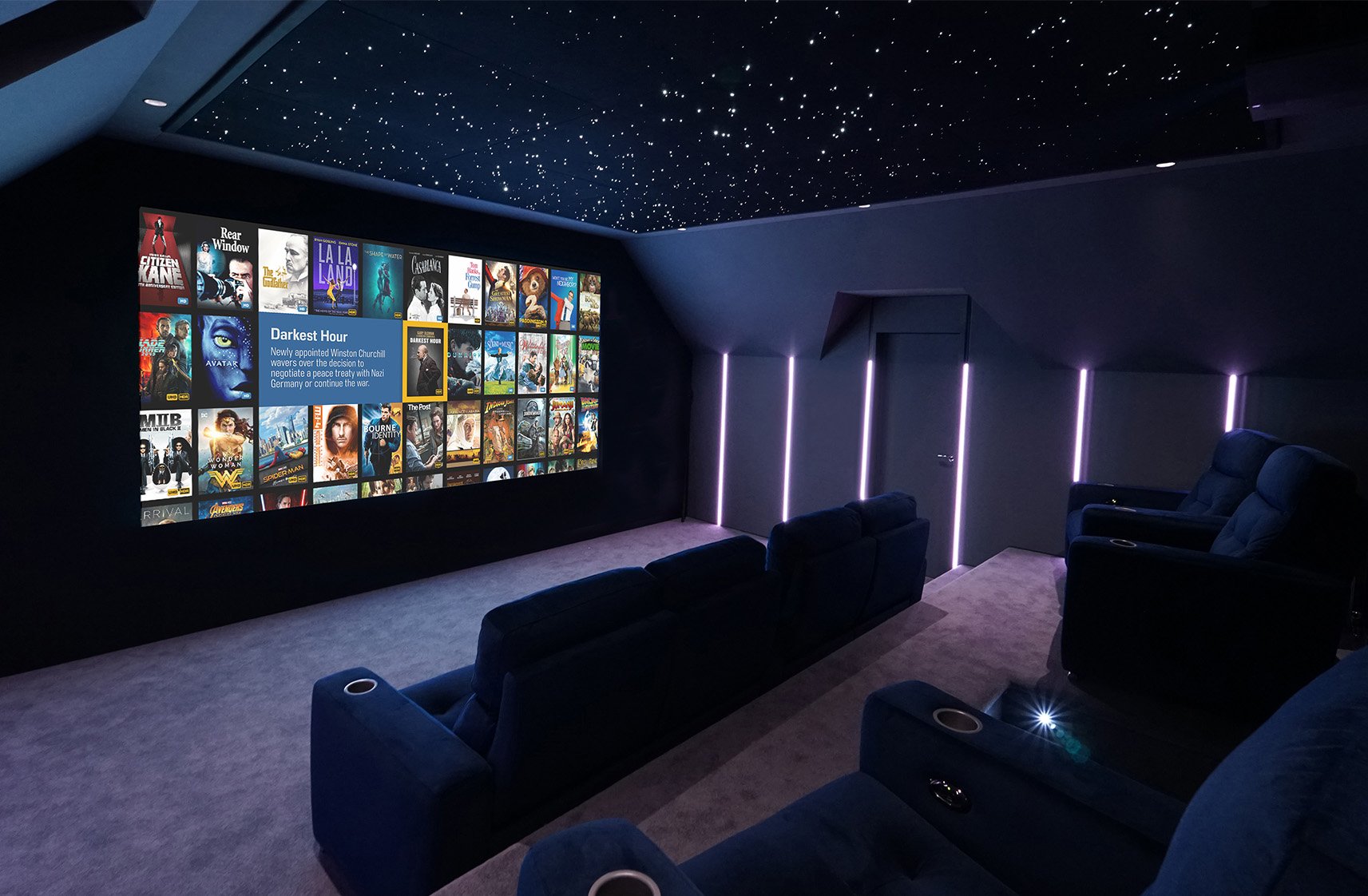
Ultra-modern with straight lines and lots of coloured LED lighting. The Cinemaworks demo room below can look very ‘futuristic’ indeed with the right pixel scene, but with muted lighting it can also look fairly classic and understated.
LED lighting in cinemas adds plenty of drama, but of course you can switch them off to be fully immersed in the action.
Picture Courtesy of Cinemaworks
Classic contemporary
Modern, but classy and a bit more understated. Darker colours like greys are recommended.
Picture Courtesy of Bespoke Home Cinemas
Themes
Favourite films, sports teams, or any special interest you might have can form the basis for your room style. Cinemas are already quite indulgent and escapist, so it’s fine to lean into it. That said, maybe don’t do anything too focused on little kids - right now they love Pixar, but in a few years they’ll be over it.
The room should last you a long time so make sure your chosen theme isn’t a passing fad.
Picture Courtesy of Bespoke Home Cinemas
Whatever your style, we should work within these key principles:
Bad ideas
To really serve you properly, we have an obligation to push back against flawed ideas, that we know won’t work.
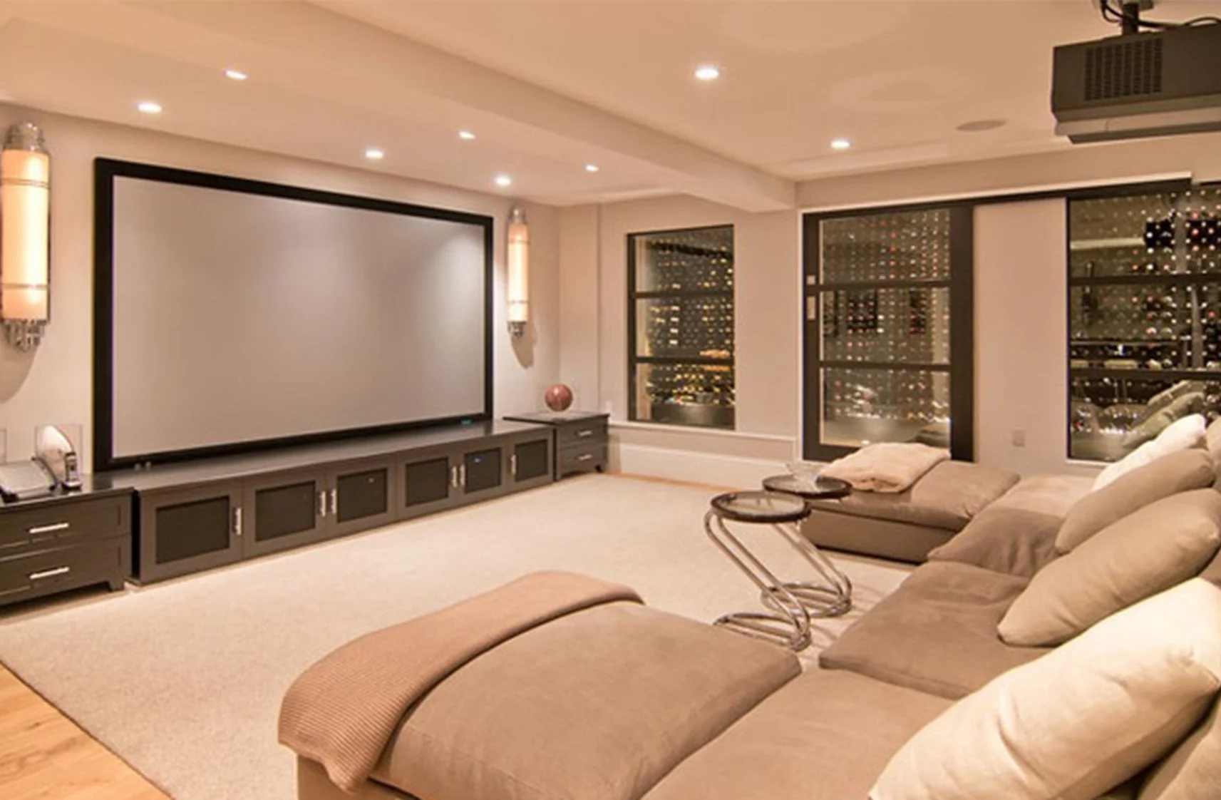
All of us sometimes get asked for really light coloured walls - white, beige or cream. The problem there is twofold - first, projected light can’t deliver the contrast that it should - cinemas need dark walls to work really well. The second problem is that the walls all light up the colour of the film, which is really distracting and the opposite of immersive.
If you have to have light coloured walls, you really want a direct display - either a really big TV or a modern modular microLED display. We can help you with that.
Example of a Beige Bright Room. Picture Courtesy of Pinterest
Engineering first
Imagine if Chris Bangle started asking to move the engine or chassis - then instead of being a leading car stylist, he’d be out of a job. Our specialty is exactly the same - the technical elements and engineering should go hand in hand with styling.
It’s no good - but sadly common - to lay the room out first and then ‘shoehorn’ the system in. All that happens then is speakers in the wrong place, wrong sized screens, or screens too high, or clunky ergonomics.
It’s much better to work with your cinema designer from a blank sheet of paper, and then we achieve the best layout for performance, comfort, and style.
What not to do courtesy of Bing AI Image Creator
Colour
A bit of colour in your cinema adds interest, but we wouldn’t go too bright or strong, especially on the screen wall and the first third of the room.
When we’re doing ‘high level’ performance cinemas we recommend keeping colour out of the viewing area, to ensure the best picture accuracy.
Seating, cushions and throws can give you ‘pops’ of colour that you won’t see when watching, and it’s easy to update throws and cushions when you fancy a change and to keep the room on-trend.
And of course the LED lights can change colour on demand.
Picture Courtesy of Cyberhomes
Lighting
Lighting design is critical for a cinema project and needs just as much planning as the speakers, projector, screen and seats.
LED drivers should be as close to the LED strips as possible to prevent voltage loss, and if you’re doing coloured and pixel that should be planned out in detail.
So the big takeaways are: engage help as early as possible in the build, before the electrical first fix, to make sure the lighting is all in the right place and the right sort.
Picture Courtesy of New Wave
Artwork
Art is fine - film posters, memorabilia, or football images - but again we’d keep them outside the viewing area. Take care with glass fronts - instead we can screen print onto acoustic fabric, to conceal speakers or acoustic treatments. Glass can cause light reflections from the screen and also create unwanted reflections in the sound.
Picture Courtesy of Immersive Cinema Rooms
Whatever your favourite style, HCA members have the training and experience to give you the very best results.
Written by Owen Maddock of Cinemaworks


